Latest Describe Graphs
Date 07/09/2020
Center: Sydney
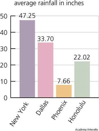
Best Answer: The given bar graph represents the average rainfall in inches for four cities in United states. If you follow the graph closely, you can observe that the majority rainfall occurs in Newyork, which closely touches to 50 inches , followed by Dallas, Honolulu and Phoenix with approximately 33, 22 and 7 inches . After analyzing the details given in this graph, we can conclude that, Newyork acquires majority rainfall and Phoenix held a last position
Center: Melbourne
Date 08/09/2020
More Previous PTE Graphs
plz.provide me latest essay
http://www.pearson-pte.com/pte-academic-listening-material/pte-latest-essay-questions-with-answers/
u r way is well for me
Harman please check
http://www.pearson-pte.com/pte-academic-listening-material/pte-latest-essay-questions-with-answers/
Plz provide me latest Retell lecture, repeat sentence, graphs, listening summarize,
Recently i have given PTE exam and i remember two graphs which i’ve got.
One graph has too many titles like sunrise, sunset and daylight saving and it looked like a sin wave.
The other graph is a world map and about precipitation.
If anyone else have came across such graphs, please do share sample writeup
Hi, Even I got the same graphs like Sunrise and Sunset like a sin wave and World map about precipitation.. Any sample answers please
Hello sandy can you pls tell us where is your exam held
when did u appear for exam?
Please provide maps with answers for speaking module ( Graphs)
I have real material
real material? Can you provide your material?
Hello Jay
can you pls provide your material its very helpful
Jay can you send me please
sagun.neupane@gmail.com
Would you like to share your data pls..
please can you send me some material if you have ,i am struggling for 6 in each and i am in very hard situation
Check http://www.pearson-pte.com/pte-academic-speaking-material/describe-graphs/
please provide some reading and writing blanks material
Navneet Please check
http://www.pearson-pte.com/reading-fill-in-the-blanks/http://www.pearson-pte.com/reading-fill-in-the-blanks/
http://www.pearson-pte.com/reading-fill-in-the-blanks-test-3/
http://www.pearson-pte.com/reading-fill-in-the-blanks-test-4/
Check Reading Fill In the Blanks Test -1 & Test-2
http://www.pearson-pte.com/reading-fill-in-the-blanks/
Reading Fill In the Blanks Test -3
http://www.pearson-pte.com/reading-fill-in-the-blanks-test-3/
Reading Fill In the Blanks Test -4
http://www.pearson-pte.com/reading-fill-in-the-blanks-test-4/
Please provide more describe graph. I had the same as the first one
I have got 65 each in PTE , please help me to achieve 79+
Can you please provide with the latest Retell lecture.
plz provide me latest essay list and repeat sentence, and graphs
hi Admin,
pls send me the latest describe image .
thanks
Anyone have new material for Pte
Your best answer is not correct! The rainfall is shown in inches not percentage!!!
Hi, If someone have template for describe all image (bar chart, pie chart, line graph etc) and re-tell lectures, then please share it.
Hello. And Bye.